25 YEARS LATERLogo and Brand Design
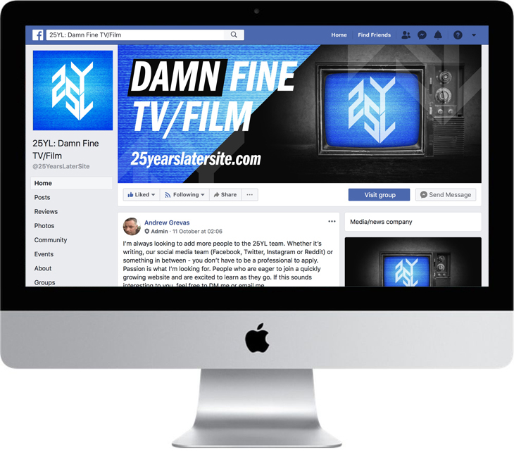
Branding, Graphic Design, Logo25 Years Later (or 25YL) is a website and internet community for fans of Twin Peaks and other cult film and TV.
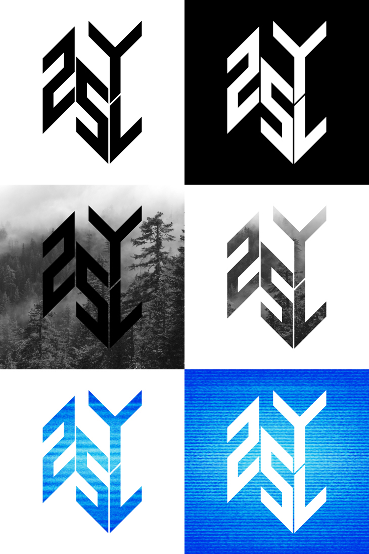
They approached me to design a logo and supporting brand. Starting with the logo, I developed an idea of combining the letters 25YL with the angled floor pattern of the iconic ‘Red Room’ from Twin Peaks. Rather than having a set colour scheme, I wanted the logo to work as a solid shape that could also be overlaid onto photos, or contain photo textures.
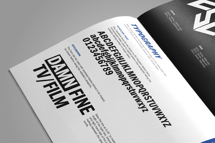
Alongside all the logo and graphics files, I created a brand guidelines PDF which explains how to use the logos, imagery and typography that make up the brand.
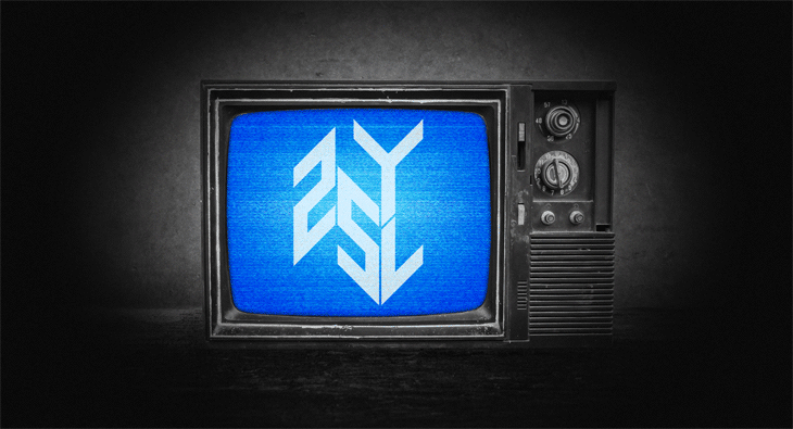
For the web page I created an animated image where the logo appears on a battered old television set, with static and glitches to bring the logo to life. A still version of this image was also use to create social media headers and profile images along with the supporting typography style (based on the typography of the film Fire Walk With Me).
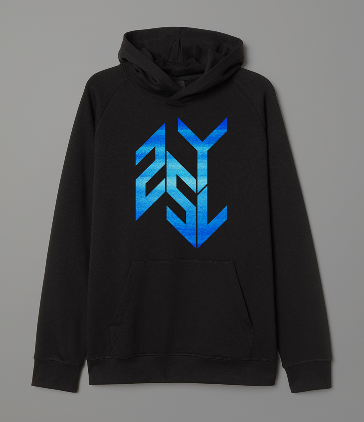
The static texture version of the logo has also been developed into wearable merchandise.